How do you rebrand a British cycling brand that’s been around since 1908?

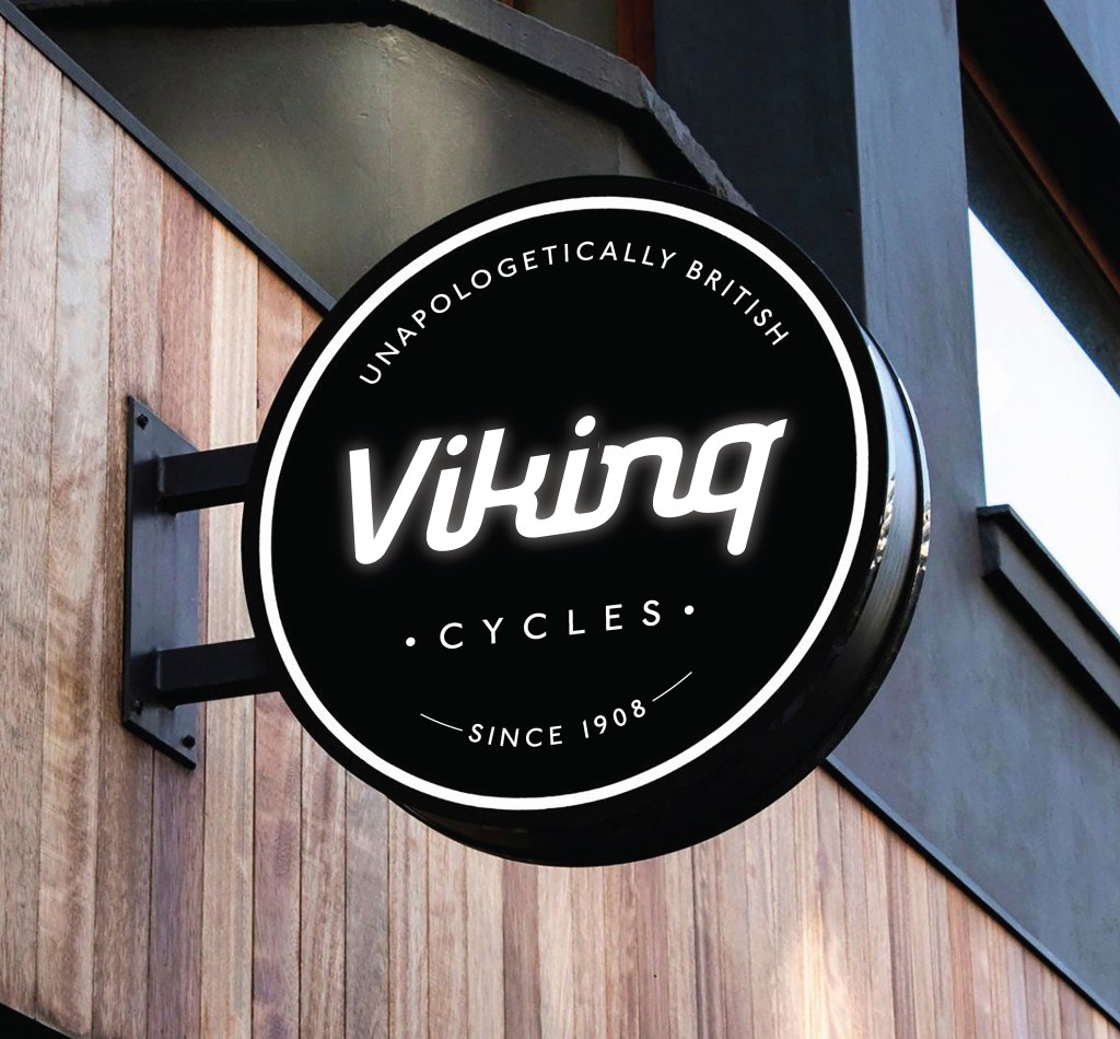
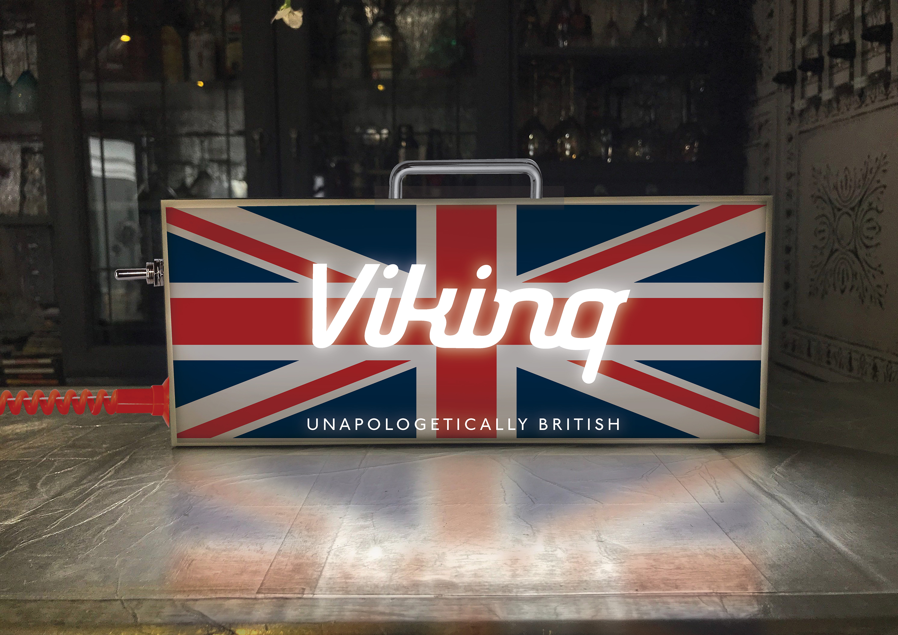
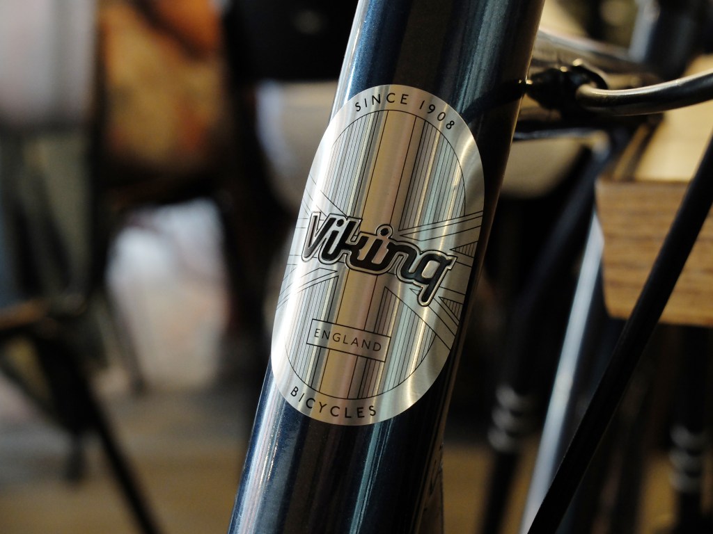
Very carefully. The key is to identify the timeless elements that have anchored the brand for over a century while also looking ahead to align with future aspirations. This approach allows us to preserve the brand’s rich heritage while evolving it for today’s market. A notable feature that has stood the test of time is the distinctive descender on the ‘g’ in the logotype, maintained through every redesign. For the imagery, I wanted to shift the focus to the city as the backdrop, highlighting Viking’s bikes as the perfect choice for casual urban riders.